8 New Builder Updates for Better Headers, Spacing, Visibility, and Responsive Control
This release brings several practical design updates to the Without Code builder, with a focus on giving you more control over how pages are structured, styled, and adjusted across different screen sizes.
You’ll find new options for showing or hiding headers and footers on specific pages, creating overlapping header effects, managing element visibility per device, browsing sections more easily, and setting default section spacing across your site.
Let’s take a look at what’s new.
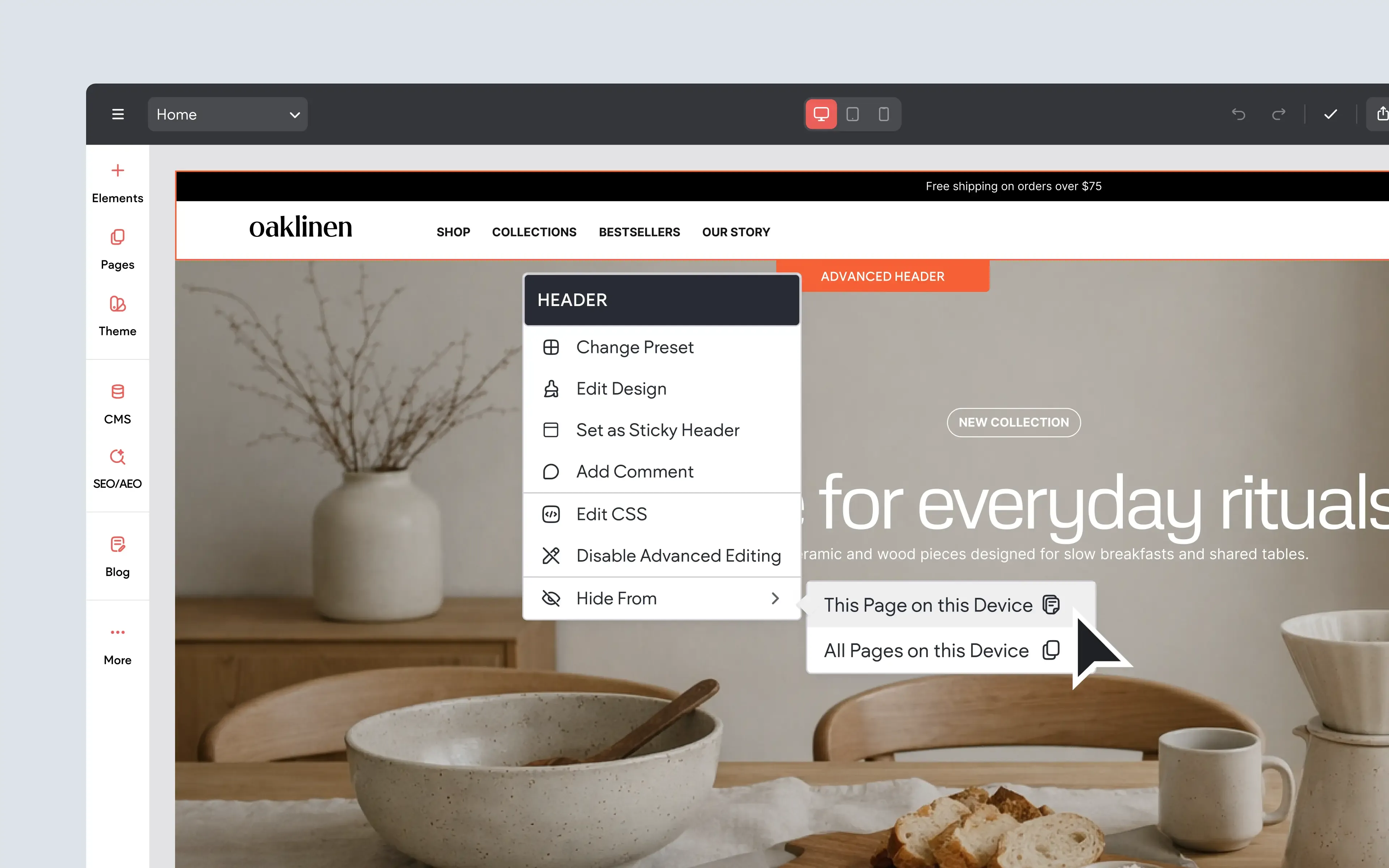
Set Your Header or Footer to Show or Hide From Any Page
You can now choose whether your site header or footer should appear on specific pages. This gives you more control over page layouts, especially when certain pages need a more focused or custom design.
For example, you might want to hide the header on a landing page, remove the footer from a simple signup page, or create a page that uses a more minimal layout than the rest of the site. Since the header and footer can be controlled separately, you can decide exactly what appears on each page.
This is a helpful update for creating more intentional page designs without needing workarounds or custom layouts.
This feature is available when using Editor 2.0.
To Use:
Right-click the header or footer and choose the Hide From option. To show a hidden header or footer again, open the Layers panel on the relevant page and click the visibility icon.
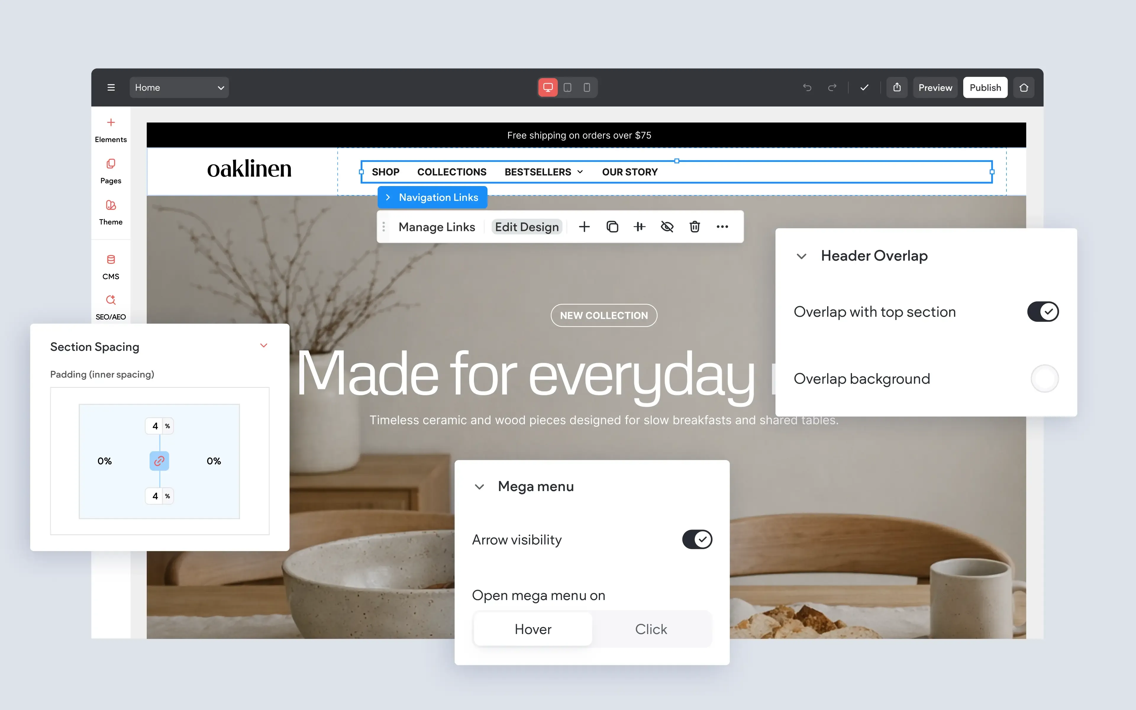
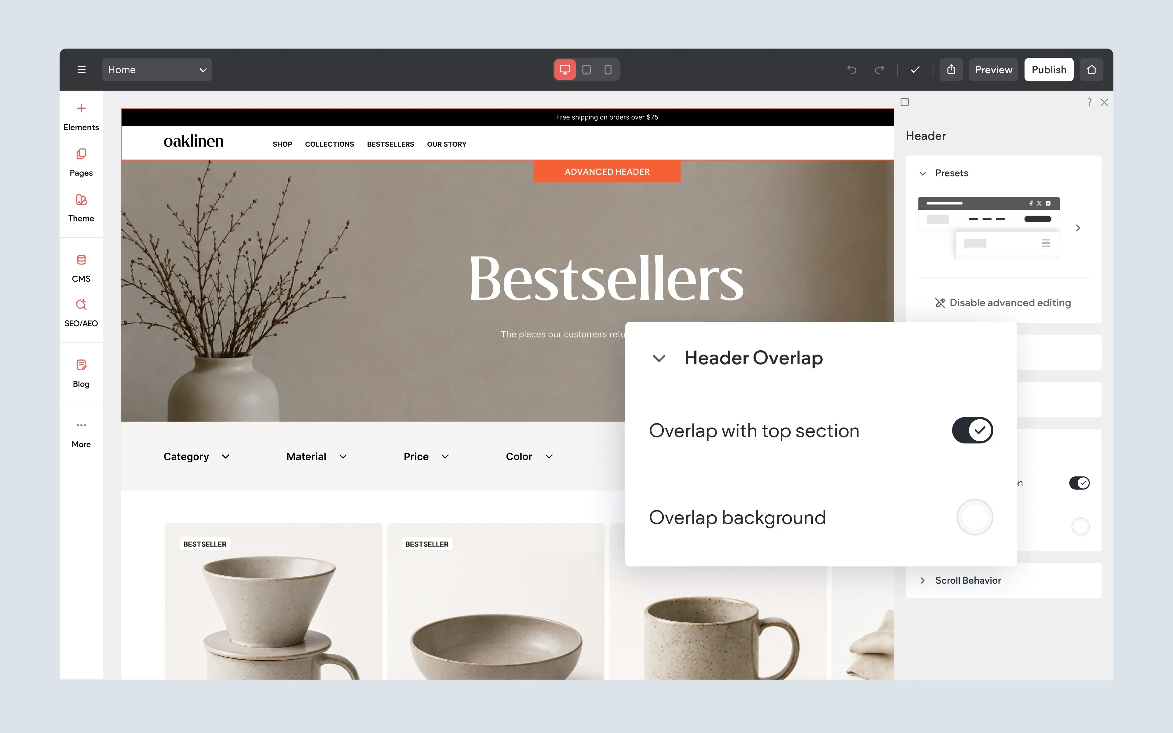
Make a Visual Impact With a Header Overlapping Effect Per Device
Headers can now overlap the top section of a page, creating a more immersive visual effect. This is especially useful when the first section of a page uses a large background image, video, or bold hero design.
Instead of the header taking up its own separate space above the page content, the header can sit over the top section. This can create a cleaner, more polished first impression while helping the top of the page feel more connected and visually engaging.
The overlap effect can also be adjusted per device, which gives you more control over how the header behaves on desktop, tablet, and mobile. This is especially helpful on smaller screens, where reducing vertical space can make the page feel more compact and easier to navigate.
This feature is available when using Editor 2.0.
To Use:
Select the header and open the design panel. Look for the Header Overlap settings, then enable and adjust the overlap effect for the screen sizes you want to customize.
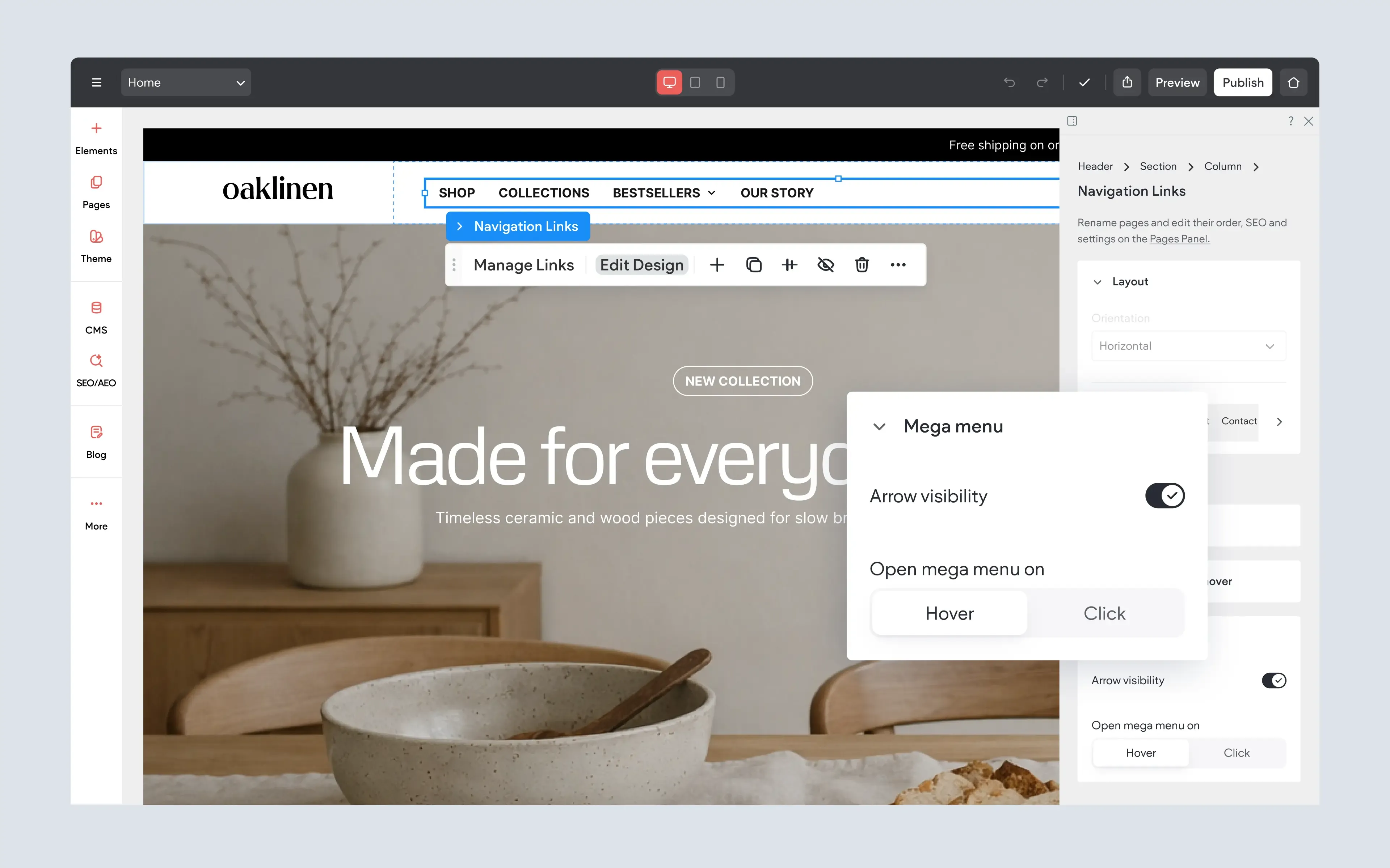
More UX Improvements to the Mega Menu
Mega menus now include a few helpful improvements that make them easier to design and manage. One new option allows you to show or hide the arrow icon that visitors use to open and close the mega menu.
This gives you more control over how your navigation appears, especially if you want a cleaner menu design or if the arrow icon is not needed for your layout. You’ll also find a wider selection of pre-designed mega menu sections, making it faster to start from a ready-made layout instead of building everything from scratch.
These updates help make mega menus more flexible while keeping the editing experience simple and approachable.
This feature is available when using Editor 2.0.
To Use:
Open the navigation or mega menu settings and look for the option to show or hide the arrow icon. When building or editing a mega menu, choose from the available pre-designed mega menu sections to start with a layout you can customize.
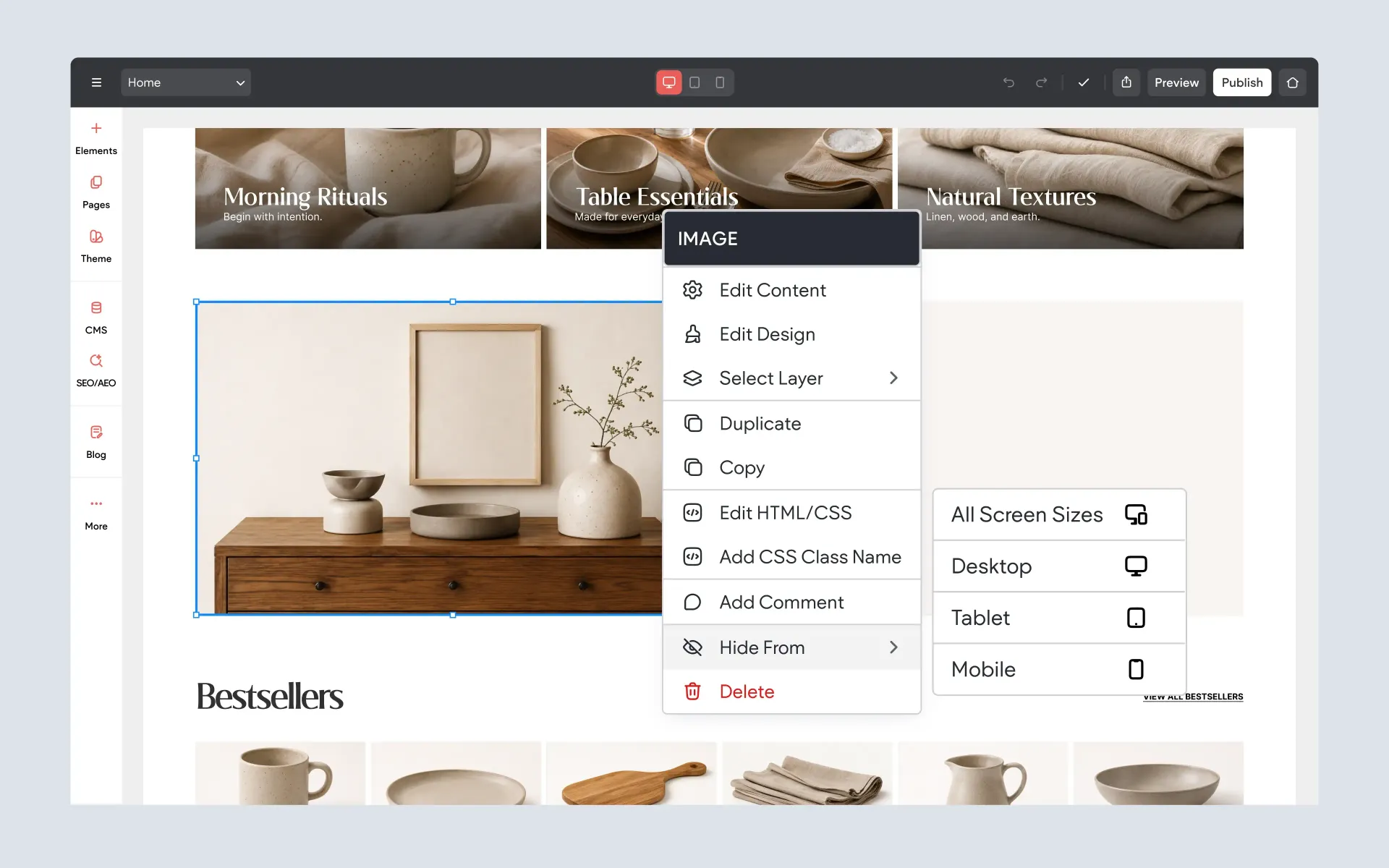
Seamless Per-Device Visibility Control Over Elements
It’s now easier to control which elements appear on different device views. You can hide an element from a specific device without needing to switch to that device view first, making visibility settings faster and more direct.
For example, you might hide a large image on mobile, remove a desktop-only section from tablet, or create different versions of an element for different screen sizes. You can also hide an element from all devices at once using a single option from the right-click menu.
This update makes responsive editing easier because you can manage visibility settings more clearly across desktop, tablet, and mobile.
This feature is available when using Editor 2.0.
To Use:
Right-click an element and choose the visibility option for the device view you want to control. To show a hidden element again, switch to the relevant device view, open the Layers panel, and click the visibility icon.
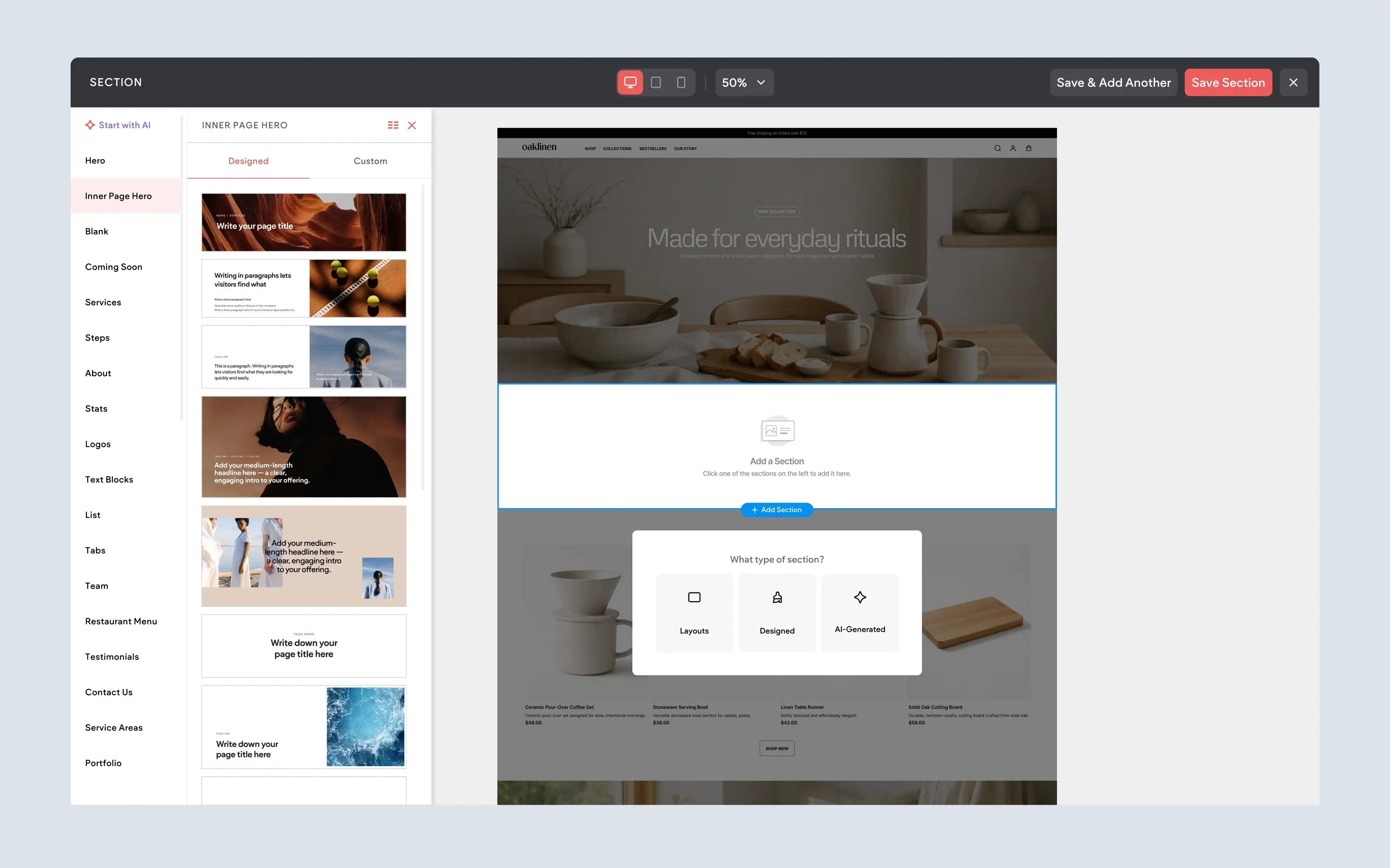
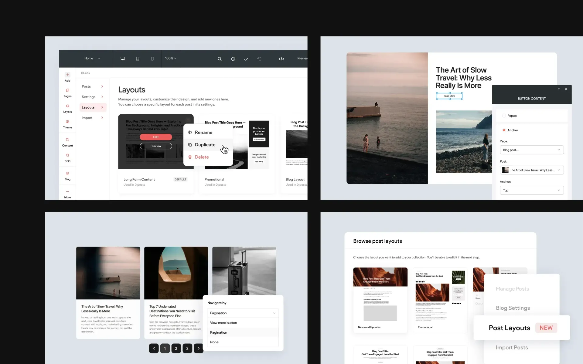
UX Improvements to Sections and Section Categories
The section experience has been improved to make it easier to browse, find, and reuse sections while building pages. Section categories can now be scrolled more naturally, so you no longer need to rely on up and down arrow clicks when moving through the category list.
There are also new Designed and Custom section tabs, making it easier to separate ready-made sections from sections you or your team have saved for reuse. This helps keep the section library more organized, especially when you’re working with a growing collection of layouts.
This feature is available when using Editor 2.0.
To Use:
Open the section panel while editing a page. Use the section category list to browse available options, or switch between the Designed and Custom tabs to find pre-designed sections or reusable custom sections.
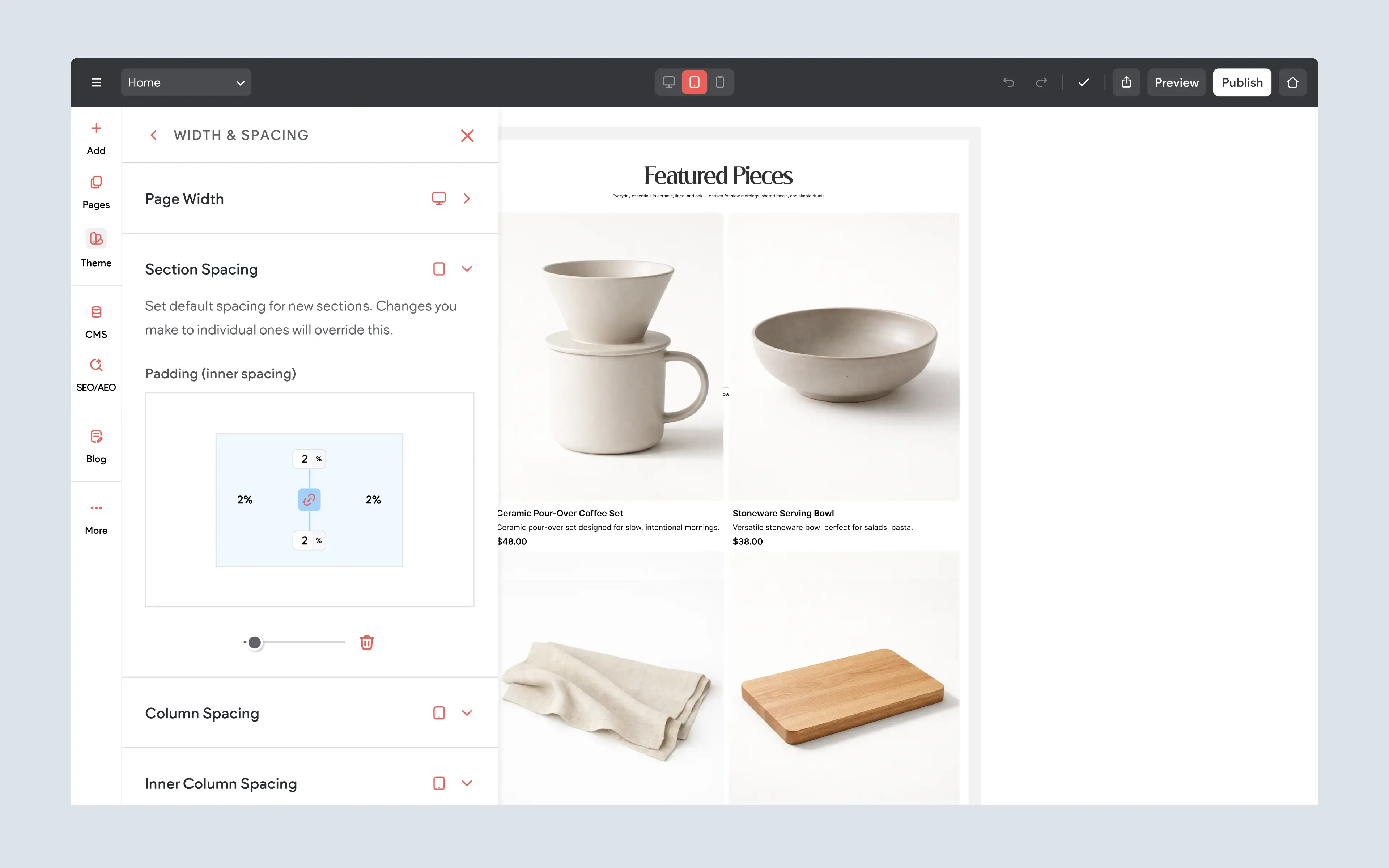
Cross-Site Spacing Settings and Site Theme
You can now set default section spacing from the Site Theme, helping create more consistent spacing across an entire site. When a new blank section is added, it can automatically inherit the spacing values defined in the Site Theme.
This is useful for keeping layouts more consistent without manually adjusting spacing each time a new section is added. Instead of setting section spacing one section at a time, you can define a default and use it as a starting point throughout the site.
For larger sites, this can help maintain a cleaner, more polished design system and reduce repetitive editing.
This feature is available when using Editor 2.0.
To Use:
Open the Site Theme settings and adjust the default section spacing. New blank sections added to the site will inherit the spacing values you define there.
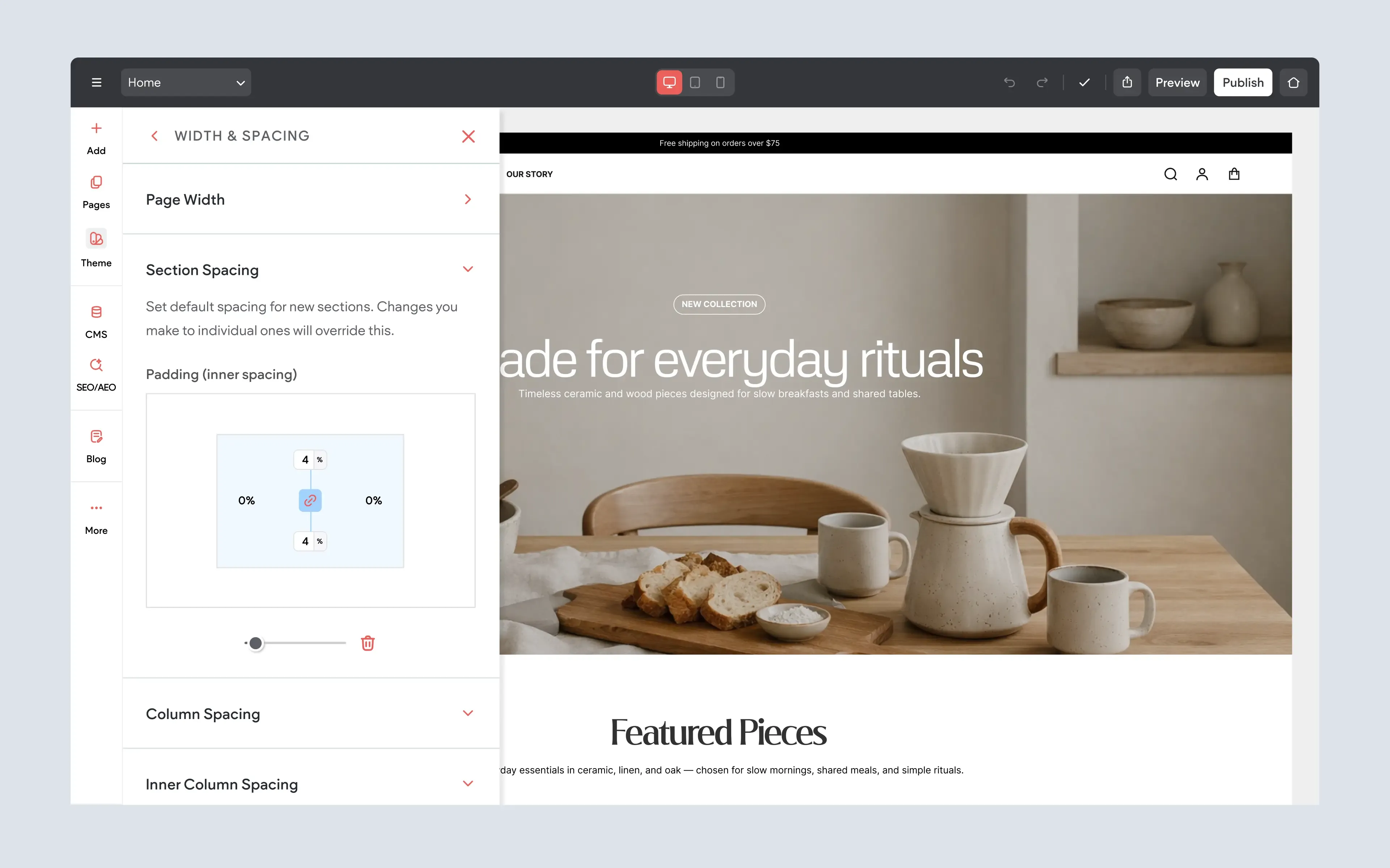
Full Control Per Screen Size
The new site-wide section spacing settings also give you control per screen size. This means you can define different default spacing values for desktop, tablet, and mobile, helping your site feel better balanced across every device.
This is especially helpful because spacing that works well on desktop may feel too large on mobile, while spacing that looks good on mobile may feel too tight on larger screens. With per-screen-size control, you can set defaults that better match each viewing experience.
The result is a more responsive design workflow, with site-wide spacing settings that still give you the flexibility to fine-tune how pages appear on different devices.
This feature is available when using Editor 2.0.
To Use:
Open the Site Theme spacing settings and adjust the default section spacing for each screen size. Set the values you want for desktop, tablet, and mobile so new sections inherit spacing that fits each device view.
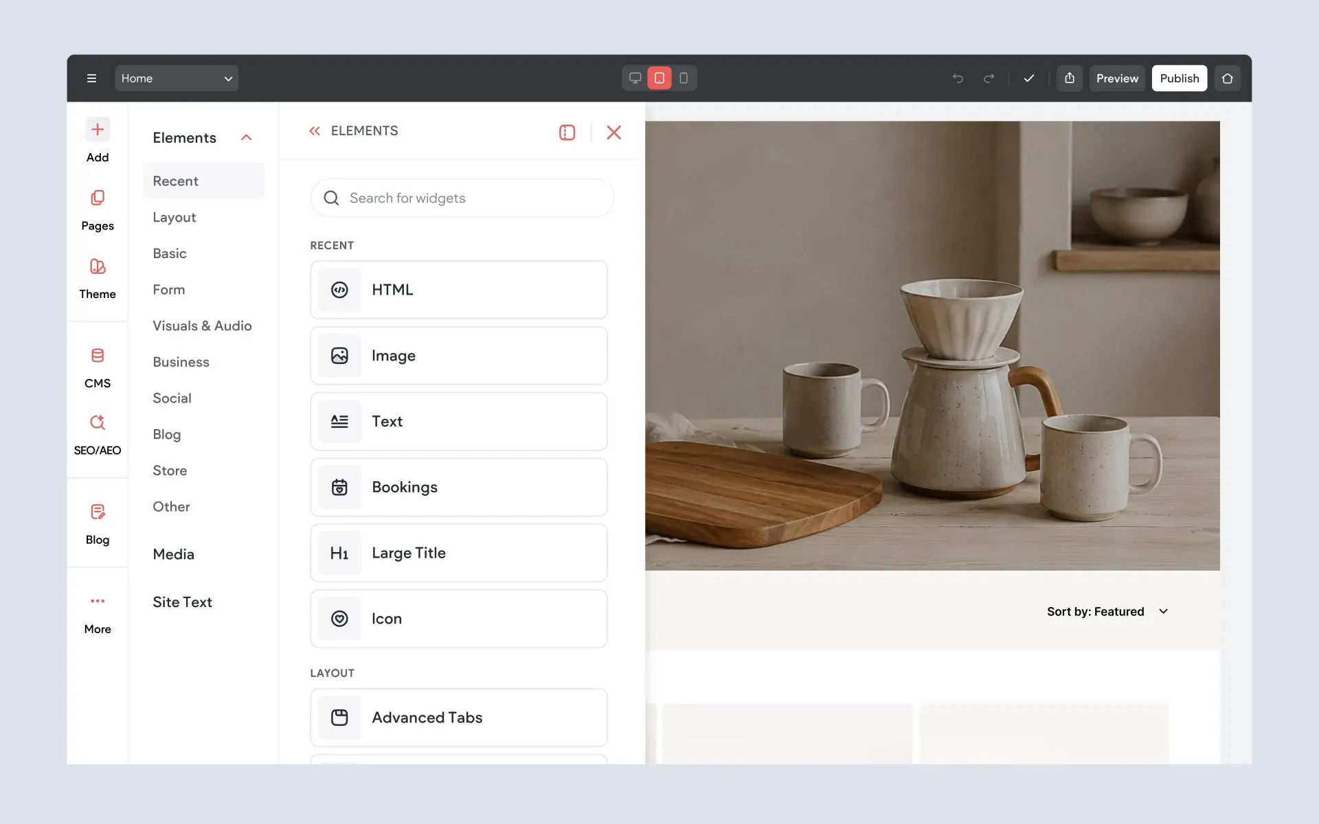
A Cleaner Way to Find and Add Elements
The widgets panel has been reorganized to make it easier to find the right element while building a page.
Previously, widgets were shown in one long scrolling panel. They were grouped by category, but each widget still appeared as its own tile, which meant you often had to scroll through a large list of options to find the one you wanted.
The updated Elements panel uses a more focused category-based layout. Instead of browsing through every available element at once, you can choose a category first, such as Basic, Layout, Business, Social, Blog, or Other, then view the elements available inside that section.
This update is available in both Editor 2.0 and Classic Editor.
To Use:
Open the Add panel in the editor, then select
Elements. Choose a category from the left side of the Elements panel to view the available elements in that group, or use the search field to find a specific element directly.
More Control for Cleaner Site Designs
Together, these updates give you more control over how your site is structured, styled, and displayed across different pages and devices. You can now show or hide headers and footers by page, create stronger visual effects with overlapping headers, manage element visibility more easily, and keep section spacing more consistent across the site.
If you haven’t explored these new options yet, you can find them available now when working in
Editor 2.0.
More from Without Code
