Introducing Editor 2.0 – A Powerful, Advanced Alternative with Greater Design Control
Editor 2.0 is a major advancement for the Without Code builder, and we’re excited to announce that it’s now available for all Without Code users. This new version of the editor builds on everything users loved about Flex mode—taking that same responsive, layout-friendly approach and evolving it into a full editing experience.
Editor 2.0 is a fully separate editor that you can choose to use when starting a new site. It doesn’t replace the current editor (now referred to as the Classic Editor), but instead serves as an additional option for users who want more flexibility and control.
With Editor 2.0, you’ll have greater control over how elements are positioned and behave across all screen sizes, making it easier to build responsive websites that look and perform better on every device.
For a quick summary of what's new in Editor 2.0, watch our overview video.
The power of Flex mode, site-wide
We’ve always aimed to offer a simple, intuitive, and quick-feeling workspace to build sites. But some users have wanted more powerful advanced features and control. It can be challenging to create a workspace that is simple yet very technically advanced at the same time.
Flex mode was a solution that offered a focus on responsive design features, and has been a big hit with our users. Flex sections can be added into sites at will, giving the ability to create sites that are a mix of standard sections and Flex sections.
But what if you want an all-Flex site without needing to add new Flex sections for every bit of the design? This is why Editor 2.0 was created. Editor 2.0 is an all-Flex editor where you can utilize all of the advanced precision control that Flex offers, without messing around with sections or mixing two different editors.
Editor 2.0 introduces a more advanced editing experience inside the same builder you already know, with new layout tools, responsive flexibility, and precise control—without changing the look and feel of the platform. If you’ve ever wanted more design freedom while still working in a visual environment, Editor 2.0 is built to offer just that.
Going beyond Flex
Because Editor 2.0 is a dedicated purpose-built editor that is detached from the Classic Editor, it opens the door to capabilities that go far beyond what Flex mode alone could offer.
With Editor 2.0, we can introduce features that weren’t possible before, like the ability to create Mega Menus, use more than four columns in a row, and even design per breakpoint for finer responsive control.
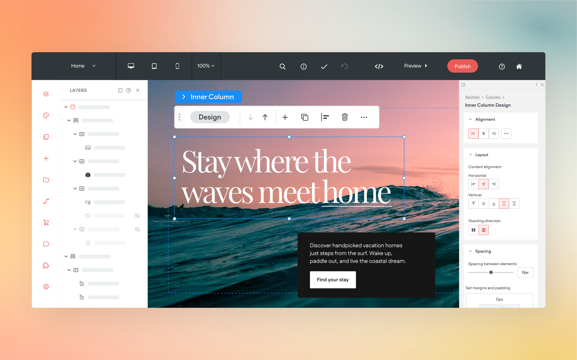
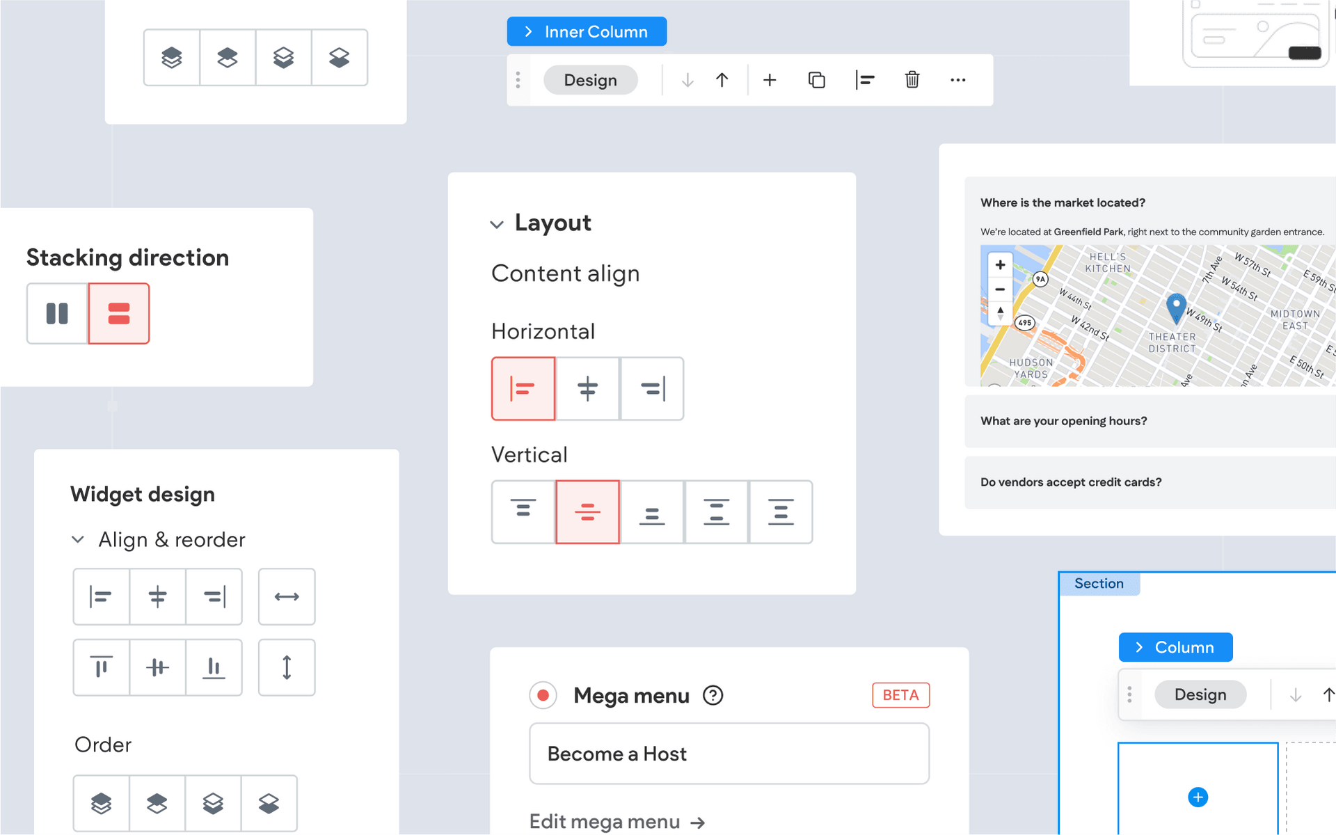
You can also now set elements to fixed or pinned positions, create more complex layouts, and use advanced spacing and alignment options—all within a streamlined visual interface. These additions make Editor 2.0 not just more flexible, but also more capable, giving you the tools to design with precision and intention, no matter the complexity of your layout.
Speaking of advanced features, let’s highlight the exciting new features in Editor 2.0:
Features in Editor 2.0
Editor 2.0 introduces several key updates that make the building process more flexible and efficient. Here’s some we’d like to highlight:
👉🏻 Fully Flex-Based Layout
Editor 2.0 uses Flex throughout the entire site, not just in sections. This gives you full control over the placement, spacing, and alignment of elements. You can nest rows, stack items, distribute space evenly, and fine-tune layouts without relying on workarounds or pre-set grids.

👉🏻 Responsive by Default
Instead of managing breakpoints manually or duplicating content for different views, Editor 2.0 layouts respond automatically across screen sizes. You can still customize how things behave on desktop, tablet, and mobile—but most of the heavy lifting is already done for you.

👉🏻 More Than Four Columns
You’re no longer limited to a four-column layout. With Editor 2.0, you can create rows with five, six, or more columns—making it easier to design complex layouts, multi-item grids, or dense sections with multiple content types.

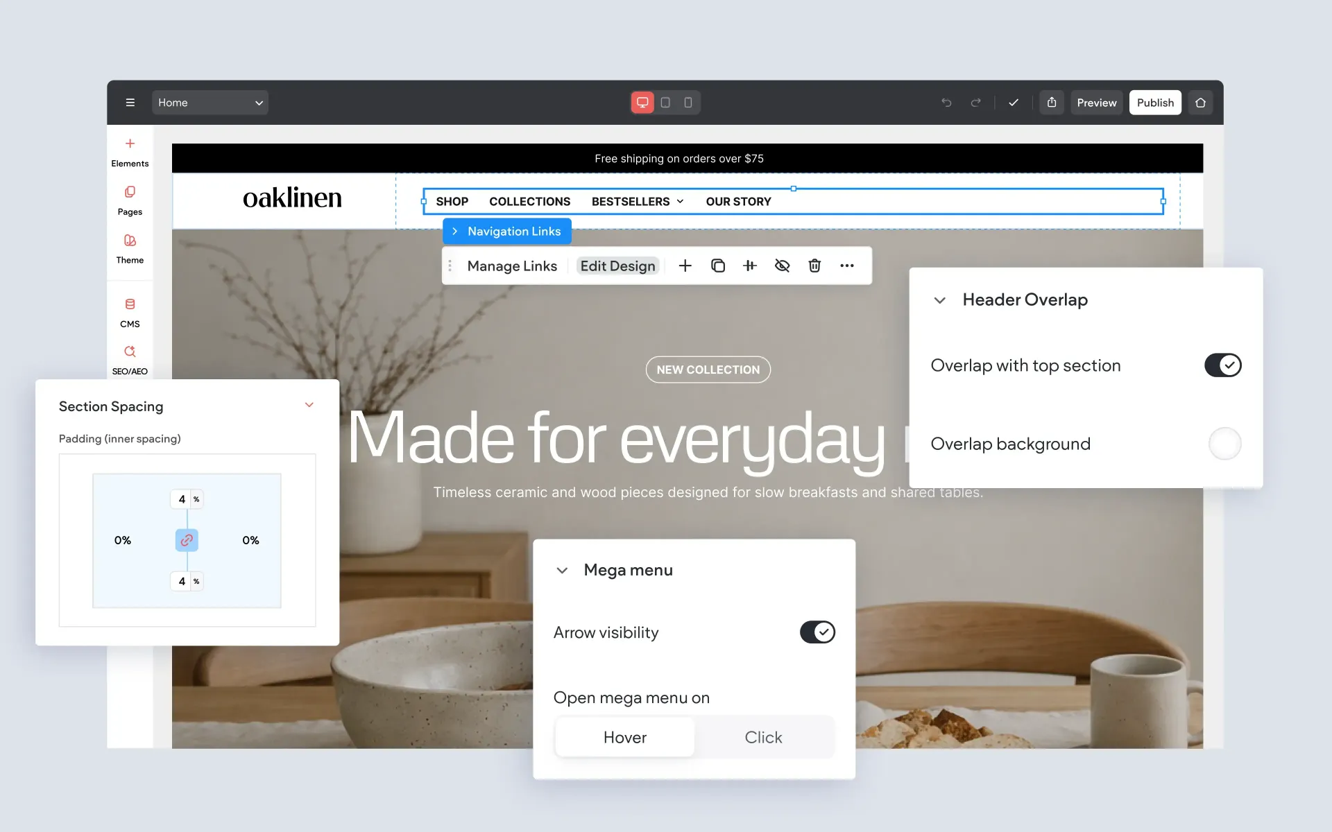
👉🏻 Fixed and Pinned Elements
Need a button that stays on screen as the user scrolls? Or a header that remains visible at all times? Editor 2.0 introduces the ability to fix or pin elements anywhere on the page. This is especially useful for call-to-action buttons, sticky navigation, or anchored visuals.

👉🏻 Design Per Breakpoint
For advanced control, you can customize layouts and styling on a per-breakpoint basis. That means you can adjust things like element order, visibility, or spacing specifically for mobile, tablet, or desktop—without affecting the rest of the design. It’s a powerful way to fine-tune the experience across devices.

👉🏻 Mega Menu
Editor 2.0 includes a built-in Mega Menu widget that makes it easy to create large, multi-column dropdown menus. You can add images, group links, and design the menu layout visually—no coding or custom structure required. This is a major improvement for sites that need robust navigation or a highly organized menu system.

👉🏻 Advanced Accordion
The updated Accordion widget gives you far more control over styling, spacing, and layout than the one in the Classic Editor. It’s perfect for FAQs, toggle content, or multi-section displays where you want a clean, interactive experience—and it looks polished right out of the box.

👉🏻 Sidebar Media Library
Add or replace images and background media directly on the canvas with a simple drag and drop. All of your media is available in a handy sidebar library, making it easier than ever to view, select, and apply images right where you're working.

Is Editor 2.0 right for you?
If you’ve connected with Flex mode, and want more of it––then Editor 2.0 is for you. If you like to customize your layouts, fine-tune how things look on mobile, or just want more responsive behavior without extra effort, this editor is likely a good fit.
That said, there are certainly many situations where the Classic Editor makes the most sense. Keep in mind, the original editor was also built to look great from device to device. Many sites don’t need advanced control or custom layouts. And if you prefer the familiarity you have with the original editor, or never really connected with Flex––no worries! The Classic Editor is not going anywhere.
Getting started with Editor 2.0 today
To use Editor 2.0, just pick an Editor 2.0 template when starting a new site. Our template picker now includes a handy toggle to switch between Editor 2.0 templates and Classic Editor templates. Look for it at the top of the template picker.
Keep in mind that the editor you choose is locked in for that site, and you can’t switch back and forth. If you’d like to take a more hybrid approach where you blend elements of the original editor with more advanced features, choose a Classic Editor template to start, and add in Flex sections as needed.
Resources
As usual, we’ve put together a bunch of handy resources and documentation to help you learn Editor 2.0:
- Overview Video: Watch here
- Difference Between Editor 2.0, Flex, and Classic Editor: Read here
- All Editor 2.0 Documentation: Browse here
More from Without Code